 Global| Jun 14 2021
It Is Different This Time, That Is, From The Last Time
|in:Viewpoints
Summary
I know that I have said that "it is different this time" are the five most dangerous words in economic forecasting. But, this most recent recession and recovery are different from the preceding cycle. Qualitatively this current cycle [...]
I know that I have said that "it is different this time" are the five most dangerous words in economic forecasting. But, this most recent recession and recovery are different from the preceding cycle. Qualitatively this current cycle most resembles the recession that began in December 1973, which resulted from the sharp cut in petroleum production by OPEC. That recession and the most recent one were caused by negative supply shocks, not by initial slowing in aggregate demand. The recession commencing in January 2008 was brought on by the bursting of the housing bubble following a series of Fed interest rate increases. The bursting of the housing bubble not only took down Main Street, but more importantly, Wall Street. I say "more importantly, Wall Street" because the bursting of the housing bubble wiped out massive amounts of depository institution capital, which caused these institutions to contract their earning assets, other than cash reserves created by the Fed. It was not until late 2011 that depository institutions were able to begin creating credit on a consistent basis. Even then, growth in depository institution credit averaged well below its pre-2008 rate. Because the current recession and the previous one are so different in causes and capital positions of depositary institutions, predicting the course of the US economy coming out of the current recession, especially the course of inflation, on how the economy performed coming out of the previous recession is perilous.
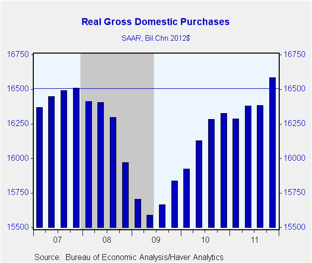
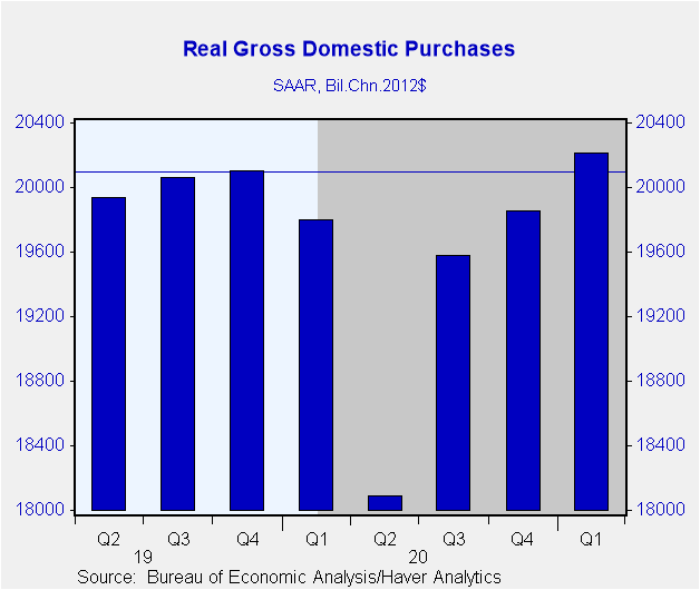
For starters, let's look at how long it took real gross domestic purchases to return to their prior peaks in the 2008 recession and the 2020 recession. Chart 1 shows this for the 2008 recession and recovery; Chart 2 for the 2020 recession and 2021 recovery. As shown in Chart 1, real gross domestic purchases did not match or exceed the Q4:2007 level until Q4:2011, 16 quarters later. In contrast, real gross domestic purchases matched or exceeded their previous peak of Q4:2019 by Q1:2021, only five quarters later. The combination of massive federal government transfers to households and businesses financed to a large degree by the Fed and the banking system, that is, financed by the creation of "thin-air" credit, boosted real and nominal aggregate demand.
Chart 1 Chart 2
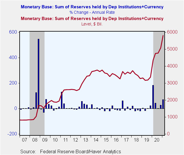
Near the onset of both the 2008 and 2020 recessions, the Fed reacted by sharply increasing the growth of credit that it creates figuratively out of "thin-air", that is, the sum of reserves held by depository institutions plus currency, or the monetary base. The Fed was a little slow out of the blocks in 2008, not boosting the monetary base until Q3:2008. But what the Fed lacked in alacrity, it made up for in quantity, increasing the monetary base in Q4:2008 at an annualized rate of 547.2%. In the case of the 2020 recession, the Fed was faster to act in boosting the monetary base but the percent increase, although still outsized, was smaller than in Q4:2008. In Q1:2020, the monetary base increased at an annualized pace of only 182.9%. These data are shown in Chart 3.
Chart 3
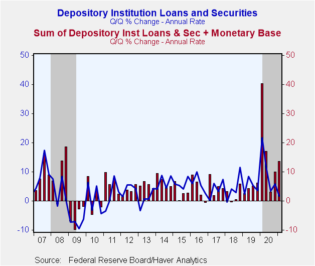
A few analysts, including yours truly, predicted that inflation was bound to pick up significantly following the massive increase in the monetary base in the second half of 2008. They, and, more importantly, I, because I hate to be wrong, were incorrect. In fact, the average percent change in the Personal Consumption Expenditures (PCE) Chain Price Index was a mere 1.4% from 2009 through 2020. I was wrong because I was fooled by the Q3:2008 8.4% annualized growth in credit created out of thin-air by the depository institution system. What matters regarding growth in nominal aggregate demand and inflation is the growth in total thin-air credit – the thin-air credit created by the Fed and the depository institution system. Chart 4 shows that the annualized change in depository institution credit dropped from 8.4% in Q3:2008 to 0.3%, minus 7.3%, minus 7.1%, minus 9.6% and minus 6.2%, respectively, in the subsequent five quarters. I did not appreciate that the surge in depository institution credit creation in Q3:2008 was due to precautionary borrowing by businesses as they tapped their credit lines. These businesses did not know whether they would be able to obtain credit later because of the massive losses depository institutions were experiencing and the increased risk aversion exhibited by lenders in general. Nor did I appreciate how much depository institutions would be contracting their balance sheets. I won't make that mistake again. Rather, I'll make some other mistake. Notice that not only did depository institution credit contract in each of the four quarters ended Q4:2009, but so did the sum of depository institution credit and the monetary base, or Fed-created credit (red bars in Chart 4).
Chart 4
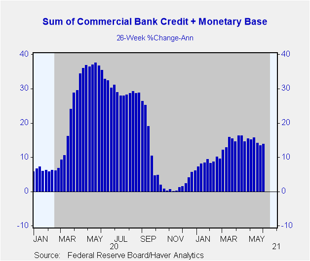
Let's fast forward to 2020 in Chart 4. Similar to Q3:2008, depository institution credit creation surged in Q1:2020 (21.8% annualized) for the same reason it did in Q3:2008. Because of uncertainty, businesses tapped their credit lines at banks. Although growth in depository institution credit has slowed after its surge in Q1:2020, it has not contracted as it did following its Q3:2008 surge. Depository institution credit has not contracted since the onset of the 2020 recession because these institutions are much better capitalized than they were at the onset of 2008 recession and, to date, have not experienced nearly the losses they did after the housing bubble burst. In the 26 weeks ended May 26, 2021, the annualized growth in the sum of commercial bank credit and the monetary base was 13.3% (see Chart 5). This compares with the average 26-week annualized growth of 7.5% from July 4, 1973 through May 26, 2021. So, the continued growth in the sum of the monetary base and depository institution credit, and relatively rapid growth at that, is a major difference between the recessions/early recoveries of the 2008 and 2020 recessions. Two different causes of recessions; two different monetary environments.
Chart 5
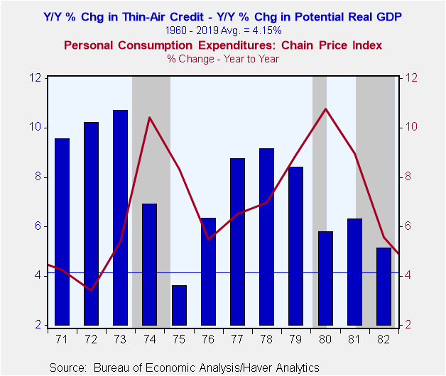
I said earlier that the current recession is (was?) akin to the 1973 recession, qualitatively speaking. In October 1973, OPEC drastically cut its production of petroleum causing a severe negative supply shock to the US economy. The blue bars in Chart 6 represent the percent changes in the annual averages of the sum of depository credit plus the monetary base or total thin-air credit minus the percent change in the CBO's estimate of annual average potential real GDP. Let's call this relative thin-air credit growth. Because thin-air credit growth affects nominal aggregate demand growth, the inflationary effect of a given growth rate in thin-air credit would be less the higher is the growth rate of potential real GDP. The red line in Chart 6 is the year-to-year percent change in the annual average PCE Chain Price Index. In the three years prior to 1974, growth in relative thin-air credit was well above its 1960 – 2019 average of 4.15% -- more than double the long-run average growth rate. Although growth in relative thin-air credit slowed in 1974, at 6.9%, it still was above its long-run average. Inflation was moving higher in 1973 before the bulk of the spike in the price of oil, which had a larger effect on the 1974 annual average inflation rate than the 1973 one. But in the midst of a negative supply shock, the Fed allowed relative thin-air credit to grow at a high rate, exacerbating the effect of higher petroleum prices on the overall rate of consumer price inflation. A second negative supply shock occurred in 1979-80 when the Iranian revolution led to a sharp drop in Iranian oil production. Growth in relative thin-air credit was above its long-run average of 4.15% in the seven years ended 1982. The average growth in relative thin-air credit from 1971–1982 was 7.58%. Again, sustained rapid growth in relative thin-air credit in the face of a negative supply shock will generate high inflation. Relative thin-air credit grew 13.67% in 2020.
Chart 6
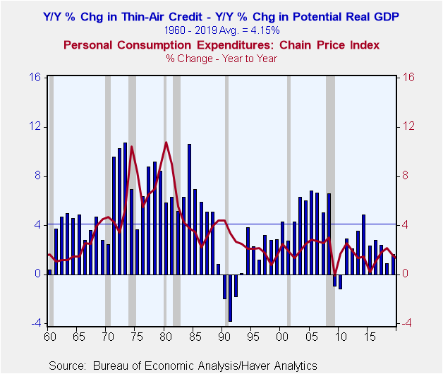
Some analysts claim that the cancer of inflation has been "cured". Globalization and increases in technology are the magic elixir that cured it. Not surprisingly, I beg to differ. I believe that the cancer of inflation has not been cured, but rather, is in "remission". And the reason it is in remission is that the Fed, inadvertently, has kept its primary cause, growth in relative thin-air credit, at low enough levels to keep the inflation cancer at nonthreatening levels. Let's go the chart, Chart 7, which is Chart 6 with a starting date of 1960 and an ending date of 2019. You can see that consumer price inflation has gradually slowed from its relatively high rates in the 1970s and 1980s. But notice what also has slowed from the 1970s and 1980s – growth in relative thin-air credit. I have divided the 1960–2019 period into three subperiods: 1960–1993; 1994–2008; and 2009–2019. Notice that in each subperiod, both the average percent change and the variability, as measured by the standard deviation (S.D.), of year-to-year percent changes in relative thin-air credit have fallen relative to the preceding subperiod. The same holds true for the PCE Chain Price Index. So, the Fed, again inadvertently, has progressively brought down the rate of growth in relative thin-air credit as well as the year-to-year variability in that growth since the 1960-1993 period. And, the rate of consumer inflation, as well as its variability, has fallen, too.
Chart 7
1960 - 1993
Relative Thin-Air Credit: Avg. % Chg. = 4.80%; S.D. = 3.54
PCE Chain Price Index: Avg. % Chg. = 4.38%; S.D. = 2.59
1994 – 2008
Relative Thin-Air Credit: Avg. % Chg. = 4.30%; S.D. = 1.77
PCE Chain Price Index: Avg. % Chg. = 2.11%: S.D. = 0.58
2009 – 2019
Relative Thin-Air Credit: Avg. % Chg. = 1.93%; S.D. = 1.71
PCE Chain Price Index: Avg. % Chg. = 1.41%; S.D. = 0.75
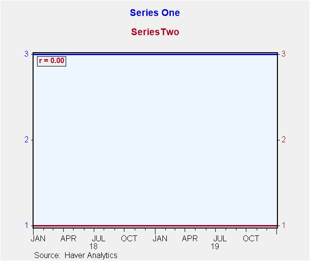
Now, I emphasize that the variability in the growth of both relative thin-air credit and the PCE Chain Price Index has fallen over time. If two series each have zero variability, the correlation coefficient between them will be zero, as shown in Chart 8. So, a claim that the relationship between percent changes in a monetary aggregate and inflation is no longer valid is itself invalid if the variability of the percent changes in the monetary aggregate has fallen.
Chart 8
In conclusion, the current recession/recovery cycle is different from the prior one. The current cycle is characterized by a negative supply shock brought on by covid. The current cycle is qualitatively similar to the 1970s' cycles brought on by negative supply shocks resulting from cuts in petroleum production. Both preceding and during the 1970s' negative supply shocks, the Fed allowed relative thin-air credit to grow rapidly, thus, exacerbating the inflationary repercussions of the negative supply shocks and causing inflation to remain elevated after negative supply shocks. Unless the Fed soon reins in current excessive growth in relative thin-air credit, it runs the risk of again exacerbating the inflationary effects of the current covid-induced negative supply shock and keeping the inflation rate at an elevated level compared to that of the prior 30 years. Why are not bond investors seeing this?
Viewpoint commentaries are the opinions of the author and do not reflect the views of Haver Analytics.Paul L. Kasriel
AuthorMore in Author Profile »Mr. Kasriel is founder of Econtrarian, LLC, an economic-analysis consulting firm. Paul’s economic commentaries can be read on his blog, The Econtrarian. After 25 years of employment at The Northern Trust Company of Chicago, Paul retired from the chief economist position at the end of April 2012. Prior to joining The Northern Trust Company in August 1986, Paul was on the official staff of the Federal Reserve Bank of Chicago in the economic research department. Paul is a recipient of the annual Lawrence R. Klein award for the most accurate economic forecast over a four-year period among the approximately 50 participants in the Blue Chip Economic Indicators forecast survey. In January 2009, both The Wall Street Journal and Forbes cited Paul as one of the few economists who identified early on the formation of the housing bubble and the economic and financial market havoc that would ensue after the bubble inevitably burst. Under Paul’s leadership, The Northern Trust’s economic website was ranked in the top ten “most interesting” by The Wall Street Journal. Paul is the co-author of a book entitled Seven Indicators That Move Markets (McGraw-Hill, 2002). Paul resides on the beautiful peninsula of Door County, Wisconsin where he sails his salty 1967 Pearson Commander 26, sings in a community choir and struggles to learn how to play the bass guitar (actually the bass ukulele). Paul can be contacted by email at econtrarian@gmail.com or by telephone at 1-920-559-0375.


