 Global| Jan 25 2021
Treasury Deficits/Debt – I Report, You Decide
|in:Viewpoints
Summary
While I was still trying to "process", as the kids say, the events that took place the Wednesday before, on January 13, the Treasury released its December 2020 budgetary data. In the Calendar Year (CY) 2020, the federal government ran [...]
While I was still trying to "process", as the kids say, the events that took place the Wednesday before, on January 13, the Treasury released its December 2020 budgetary data. In the Calendar Year (CY) 2020, the federal government ran a deficit of $3.348 trillion, which resulted in $27.748 trillion of Treasury debt outstanding at the end of CY 2020 (see Chart 1). These are records for Treasury deficits and debt in both absolute terms as well as relative terms. These outsized Treasury deficit and debt totals are destined to climb still higher in CY 2021, supercharged by the $900 billion COVID-19 relief bill just signed into law at the end of 2020 and some part of the $1.9 billion COVID-19 relief package that incoming President Biden is seeking. The purpose of this commentary is not to argue the merits or demerits of the COVID-19 relief measures passed into law in 2020 and likely to be passed into law in 2021. Rather, the purpose of this commentary is to document the unprecedented Treasury deficits and debt that have occurred. I will, of course, speculate on the economic and financial market effects of this, knowing full well that my views are outliers, now. But I am used to having outlier views. I had them in 1998 as the Dot.Com bubble was inflating. And I had them in 2005 as the housing bubble was inflating and the financial sector was loading up on mortgage debt. But to quote a well-known figure who used to be in the news until his Twitter privileges were revoked, "we'll see what happens".
Chart 1
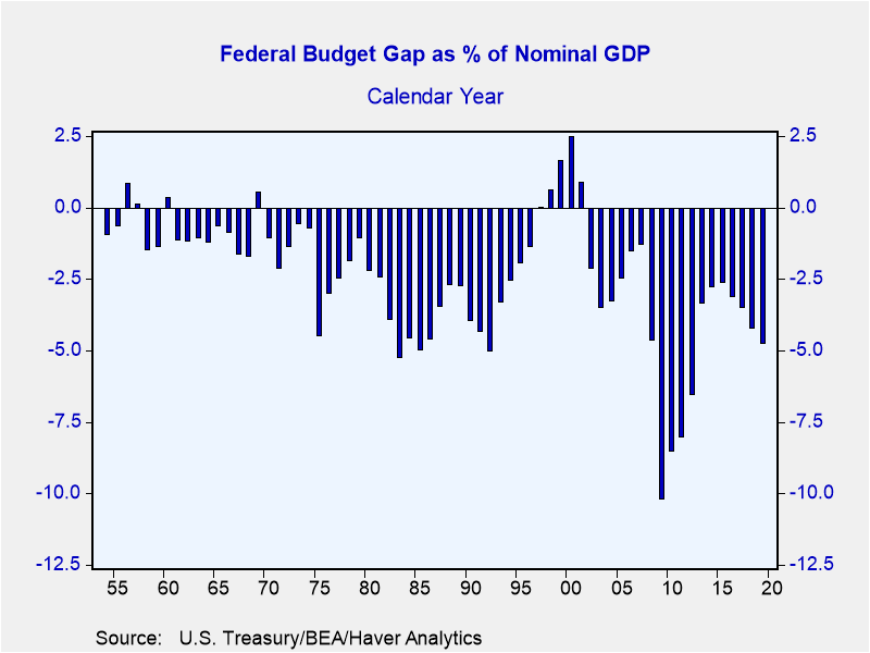
Chart 2 shows the nominal federal budget balance as a percent of nominal GDP from CY 1954 through CY 2019. During this period, the largest federal budget deficit as a percent of nominal GDP occurred in 2009, during the Great Recession when a federal stimulus of a hitherto unheard of about $850 billion was implemented. In CY 2009, the federal deficit was 10.2% of nominal GDP. The nominal GDP data for Q4:2020 are not yet available. But a ballpark estimate for Q4 annualized growth in nominal GDP growth might be 9.7%, using the Atlanta Fed's latest estimate of Q4 annualized growth in real GDP of 7.5% and actual annualized growth in the CPI of 2%. With this 9.7% estimate of Q4:2020 annualized nominal GDP growth and with actual data (until revised umpteenth times) of Q1 through Q3:2020 nominal GDP levels, an annual average level of 2020 nominal GDP can be calculated. (This calculation is left as an exercise for the reader.) Having done this, the CY 2020 federal deficit of $3.348 trillion would represent a whopping 16% of nominal GDP. You would have to go back to Fiscal Year 1943 to find a larger number for the federal deficit as a percent of nominal GDP, 29.6%.
Chart 2
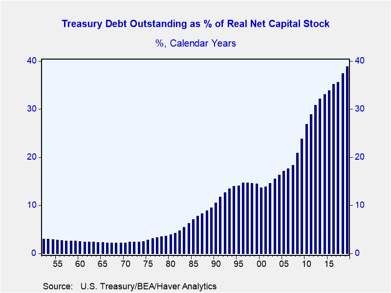
It seems to be common practice to compare Treasury debt outstanding, a stock concept, to nominal GDP, a flow concept. I prefer "apples to apples", so to speak. I believe it is logical to compare Treasury debt outstanding to the outstanding stock of physical capital and intellectual property. It is this stock of capital that plays a key role in determining the future growth of the economy. And the future growth in the economy plays a key role in determining a nation's ability to service its public debt. (The stock of human capital also plays a key role in this, but I am not aware of any measure of the stock of human capital.) Chart 3 shows the amount of Treasury debt outstanding at the end of calendar years as a percent of the real net capital stock, including the government sector, intellectual property and consumer durables, outstanding at the end of calendar years 1952 through 2019. In 2019, this ratio reached a record high of 38.8%. Assuming that the real net capital stock increased by 1.8% in 2020, which would be its fastest annual growth rate in the ten years ended 2019, then the $27.748 trillion of Treasury debt outstanding at the end of 2020 would represent 45.6% of the real net capital stock. That is a 6.8 percentage point increase in one year. Hitherto, the largest one-year increase in this ratio was 3.1 percentage points, which occurred in 2010. Speaking of the economy's ability to grow in the future, take a look at Congressional Budget Office estimates of potential real GDP annual growth from 1949 through 2030, shown in Chart 4.
Chart 3 Chart 4
Now, the extraordinarily-high federal budget deficit incurred in 2020 and likely to be incurred in 2021 are two-off events. But the Treasury debt that resulted will remain and will be added to as relatively high budget deficits will be incurred post-2021 due to rising federal entitlement spending, mainly received by my Baby Boom generation, and to a much lesser extent, defense spending. As the Modern Money Theory (MMT) (a misnomer if there ever was one inasmuch as there is nothing "modern" about it and the "theory" is difficult to discern) adherents tell us, that if the government debt is denominated in the currency that the government can print via its central bank, then the government's ability to issue debt is unrestrained. I would add in the "printing" of money, more accurately the creation of credit, by the banking system as allowing the government the unrestrained issuance of debt. The MMTers do acknowledge that at some point higher goods/services price inflation would occur. I would modify this by saying that at some point the central bank's and the banking system's creation of credit to fund both the government's borrowing and the private sector's borrowing will result in higher goods/services price inflation.
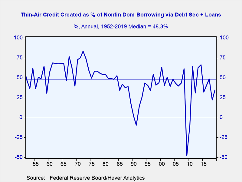
Readers of my past commentaries will recognize that the sum of central bank credit creation (money "printing") and the banking system (more accurately, depository institution system) credit creation is what I refer to as "thin-air" credit because it is credit created figuratively out of thin air. Plotted in Chart 5 are the observations of the amount of thin-air created in a year as a percent of the amount of borrowing via debt issuance (bonds, commercial paper, etc.) plus loans by the nonfinancial domestic sector in the same year. The borrowing by the domestic nonfinancial sector includes borrowing by governments, federal, state and local, as well as the private sector. From 1952 through 2019, the median value of thin-air created as a percent of borrowing by the domestic nonfinancial sector was 48.3% (the horizontal blue line in Chart 5. Since the early 1980s, thin-air credit funding of domestic nonfinancial sector borrowing has tended to be below the median of 48.3%.
Chart 5
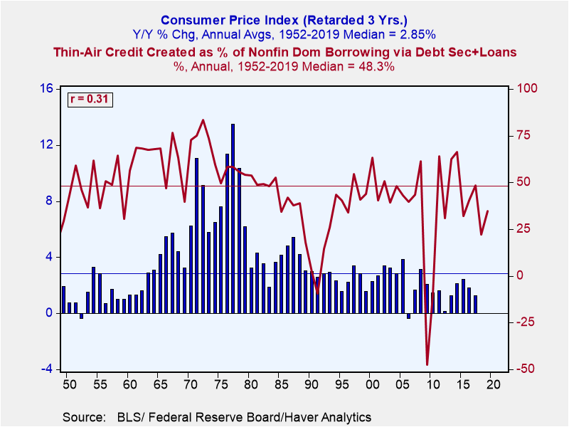
Now, let's add another variable to Chart 5, the year-over-year percent change in the annual average Consumer Price Index (the blue bars in Chart 6). The CPI data are retarded three years to illustrate how thin-air credit leads changes in the CPI. For example, the last observation of the year-over-year percent change in the CPI is that of 2020 even though it lines up with 2017 on the bottom year scale. Again, this is to illustrate how one year's behavior of thin-air credit influences the behavior of the CPI three years later. The correlation coefficient, 0.31, is shown in the box in the upper left-hand corner of Chart 6. This correlation coefficient is the highest magnitude obtained by testing lead-lag relationships between the two variables. Although a correlation coefficient with a magnitude of 0.31 is nothing to brag about, it does suggest that the greater is the proportion of thin-air credit financing of domestic nonfinancial sector borrowing today, the faster will grow the CPI three hence. As an aside, if you compare year-over-year percent changes in annual averages of thin-air credit with those of the CPI, you will find that the highest-magnitude correlation coefficient between the two is 0.58, with the change in thin-air credit leading the change in the CPI by two years.
Chart 6
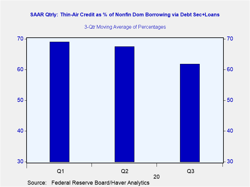
So, with the surge in Fed created and depositary institution created credit in 2020, what proportion of nonfinancial sector borrowing has been accommodated by thin-air credit? The data in Chart 7, especially the last blue bar answers the question – 61.8%. Again, this compares with the 1952 – 2019 median contribution of 48.6%.
Chart 7
The federal government's borrowing requirement will remain large in CY 2021. As the US population gets vaccinated against COVID-19, those sectors most harmed by the virus in 2019 -- food service, air travel, accommodations, education and elective/preventative medical – will come roaring back. The Fed has given every indication that it will let the economy run "hot" for an undefined period before it cuts back on its credit creation. Unlike during and immediately following the Great Recession, the US banking system is currently exceptionally well capitalized. This means that it, too, can accommodate the domestic nonfinancial sector's demand for credit, which will be rising due to the federal government's near insatiable demand along with a strong recovery in the overall economy. I report, but you can decide if the inflation bridge that the MMTers tell us we might have to cross is looming in 2022 and 2023.
Viewpoint commentaries are the opinions of the author and do not reflect the views of Haver Analytics.Paul L. Kasriel
AuthorMore in Author Profile »Mr. Kasriel is founder of Econtrarian, LLC, an economic-analysis consulting firm. Paul’s economic commentaries can be read on his blog, The Econtrarian. After 25 years of employment at The Northern Trust Company of Chicago, Paul retired from the chief economist position at the end of April 2012. Prior to joining The Northern Trust Company in August 1986, Paul was on the official staff of the Federal Reserve Bank of Chicago in the economic research department. Paul is a recipient of the annual Lawrence R. Klein award for the most accurate economic forecast over a four-year period among the approximately 50 participants in the Blue Chip Economic Indicators forecast survey. In January 2009, both The Wall Street Journal and Forbes cited Paul as one of the few economists who identified early on the formation of the housing bubble and the economic and financial market havoc that would ensue after the bubble inevitably burst. Under Paul’s leadership, The Northern Trust’s economic website was ranked in the top ten “most interesting” by The Wall Street Journal. Paul is the co-author of a book entitled Seven Indicators That Move Markets (McGraw-Hill, 2002). Paul resides on the beautiful peninsula of Door County, Wisconsin where he sails his salty 1967 Pearson Commander 26, sings in a community choir and struggles to learn how to play the bass guitar (actually the bass ukulele). Paul can be contacted by email at econtrarian@gmail.com or by telephone at 1-920-559-0375.


