 Global| Oct 26 2020
Why Can't the Fed Raise the Inflation Rate? Why Would It Want To?
|in:Viewpoints
Summary
On August 27, Fed Chairman Powell gave a speech entitled "New Economic Challenges and the Fed's Monetary Policy Review". The main "challenges" seemed to be a very low "neutral" or equilibrium interest rate structure and very low rates [...]
On August 27, Fed Chairman Powell gave a speech entitled "New Economic Challenges and the Fed's Monetary Policy Review". The main "challenges" seemed to be a very low "neutral" or equilibrium interest rate structure and very low rates of actual and expected consumer price inflation. As I interpret Powell, the reason these were viewed as challenges is that the level of the inflation-adjusted federal funds rate might turn out to be higher than the neutral level in a deflationary environment with a nominal federal funds rate at zero. For example, if annualized price deflation were 2% and the nominal federal funds rate were zero, then the real, or deflation-adjusted federal funds rate would be positive 2%. If the neutral federal funds rate were below 2%, then the Fed would not be able to lower the nominal federal funds to the level of the neutral federal funds rate unless the Fed moved the nominal federal funds rate into negative territory. In order to meet this "challenge" of low actual and/or expected price inflation, the Fed is planning to keep the nominal federal funds rate low for an extended period of time so as to achieve "maximum" employment and to achieve an annualized consumer price inflation rate of 2% on average. The Fed does not define what "maximum" employment is nor does it specify of what time period it intends to have consumer price inflation average 2% annualized. In what follows I will argue that the relatively low consumer inflation rate that has prevailed in the US in recent years has been associated with relatively good outcomes with regard to employment, that low inflation and/or deflation is not a hindrance to the Fed achieving high employment, that inflation of asset prices perhaps ought to be taken into consideration by the Fed. Lastly, I will offer an explanation as to why consumer price inflation has been running at relatively low rates in recent years. I'll give you a hint. It is related to the relatively low rates of growth "thin-air" credit, wittingly or unwittingly, engineered by the Fed. Warning: This is going to be long one, so caffeinate accordingly.
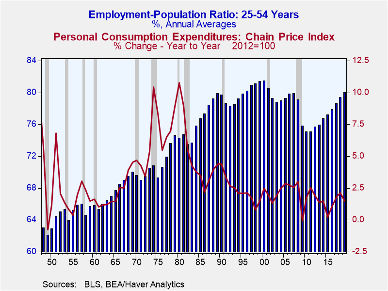
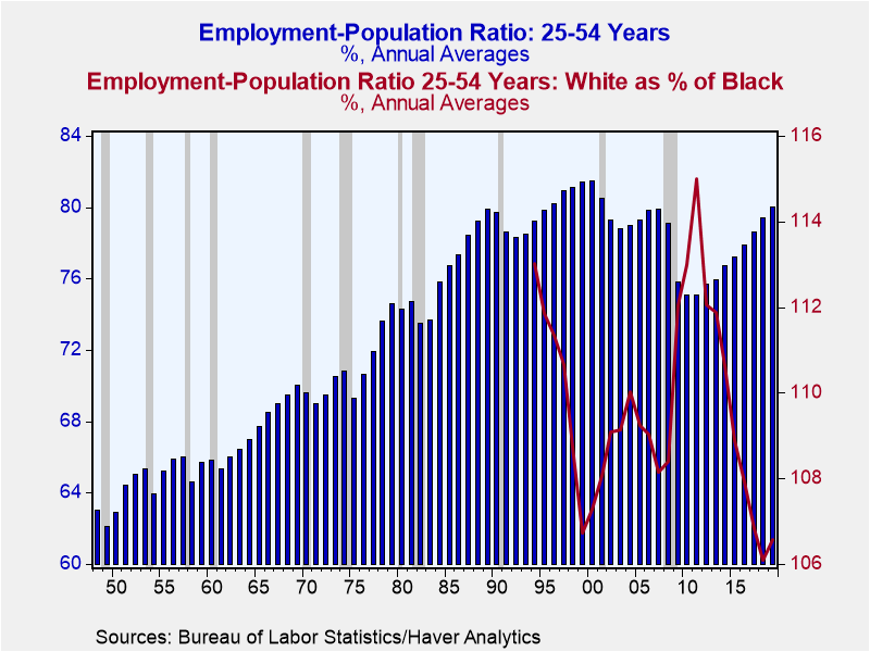 A measure that I find useful in gauging the strength of the labor market is the ratio of employment to the population. More specifically, the ratio of employment to the population for prime-age workers, i.e., the population of workers between the ages of 25 and 54, is my preferred measure. The problem with the unemployment rate is that it does not include people who drop out of the labor for various reasons, some temporary, some permanently. The blue bars plotted in Chart 1 are the annual averages of the employment-to-population ratio for 25- to 54-year olds. From 1948 through 2019, the highest ratios occurred in the years 1996 through 2001, when the ratio averaged 80.9 with high of 81.5 in 2000. In 2019, this employment-to-population ratio reached a level of 80.0, the highest since 2001. Categorized by race, this ratio goes back only to 1994. The red line in Chart 1 compares employment-to-population ratios for 25- to 54-year olds between white and blacks. Specifically, it is the white ratio as a percent of the black ratio. The lower the percentage, the closer is the black ratio to the white ratio. The low for this percentage was 106.1%, recorded in 2018. The percentage edged up to 106.5% in 2019. The previous low was 106.7%, which occurred in 1999, when the overall ratio of employment-to-population for 25- to 54-year olds was 81.4, just off the record 81.5 set in 2000. I do not know if the Fed would characterize the high employment-to-population ratios for prime-age workers and the low percentages of these ratios for the white population relative to the black population in recent years as "maximum" employment, but I would argue that it's a movement in that direction.
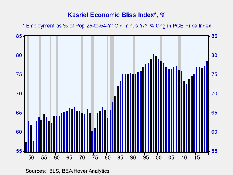
If you agree with me that employment situation has been pretty good in the past couple of pre-Covid years, then let's look at the behavior of consumer price inflation, the red line in Chart 2 below. From 1948 through 2019, the median year-over-year percent change in the Personal Consumption Expenditures (PCE) price index was 2.5%. From 1985 through 2007, the so-called "Great Moderation" period, the median annual PCE inflation rate was 2.5%. From 2010 through 2019, the median PCE inflation rate was 1.6%. Let's combine these two variables into what will soon become known as the Kasriel Economic Bliss Index (KEBI trademark pending). The KEBI is defined as employment as a percent of population for 25- to 54-year olds minus the year-over-year percent change in the PCE price index. The higher is the employment-to-population ratio, the higher is economic bliss, all else the same. The lower is the consumer inflation, the higher is economic bliss, all else the same. The annual levels of the KEBI from 1948 through 2019 are plotted in Chart 3 below. The median value of the KEBI from 1948 through 2019 was 70.7 percent. During the Great Moderation, 1985 through 2007, the median value of the KEBI was 76.9 percent. In the period from 2010 through 2019, the median value of the KEBI was 76.0 percent. Given that the US experienced relatively high economic bliss in the 2010 through 2019 period, it might be suggested to the Fed regarding its monetary policy that if it ain't broke, don't fix it. Of course, this makes the heroic assumption that the Fed actually knew what it was doing during this relatively blissful period.
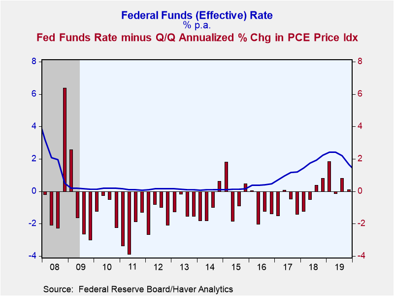
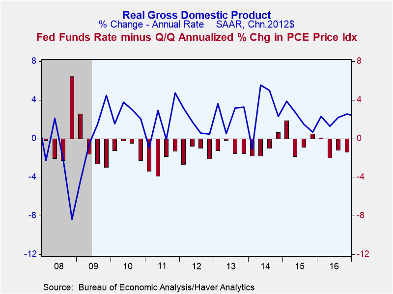
Now to the Fed's fear that the (guessed at) neutral inflation-adjusted federal funds rate might be negative when the nominal federal funds rate has hit its zero bound. If this were to occur during a period of consumer price deflation, the only way the Fed could achieve a negative inflation-adjusted federal funds rate would be to engineer a negative nominal federal funds rate, i.e., require banks that held Fed-produced reserves to pay the Fed for these reserves. Plotted in Chart 4 below are quarterly averages of the nominal federal funds rate (the blue line) along with the nominal federal funds rate minus the quarter-to-quarter annualized percent change in the PCE price index (the red bars). Cases when the inflation-adjusted federal funds rate was positive and the nominal federal funds rate was on a course to or near zero occurred in Q4:2008-Q1:2009, Q4:20014-Q1:20015 and Q4:2015-Q1:2016 in the 2008 through 2019 period. These are instances when the "neutral" inflation-adjusted federal funds rate might have been negative. But the quarter-to-quarter annualized percent changes in real GDP were negative only in the Q4:2008-Q1:2009 period, in the depths of the Great Recession, as shown by the blue line in Chart 5 below.
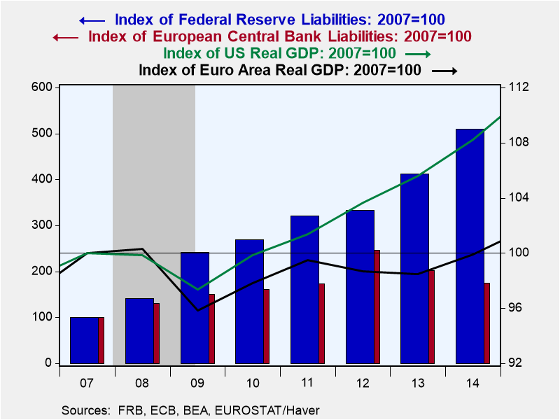 The Fed was able to generate real GDP growth following the Great Recession with a zero nominal federal funds rate and occasional positive inflation-adjusted federal funds rates because of its still misunderstood policy of quantitative easing, i.e., ballooning up its balance sheet. The Fed was much more aggressive in enlarging its balance sheet than was, say, the European Central Bank (ECB). By 2014, the Fed's balance sheet was 410% higher (510-100) than it was in 2007. The level of US real GDP in 2014 was 8% higher than it was in 2007. In contrast, the ECB's balance sheet in 2014 was only 74% higher than it was in 2007 and the level of Euro-Area real GDP was still just shy of its 2007 level. This is shown in Chart 6, of which I am very proud but will take the reader some time to figure out. The Fed continues to underestimate its ability to generate growing real GDP in the presence of a zero federal funds rate level and low inflation or deflation. Why the Fed remains obsessed with low inflation or deflation is beyond me.
 When the Fed and most others, for that matter, speak of inflation, they are typically talking about the rate of increase in the prices of goods and services. But other prices rise, too, specifically the prices of assets such as the prices of houses and equities. Asset price inflation tends to be neglected when it comes to monetary policy. For example, during the housing boom that preceded the onset of the Great Recession, house prices rose dramatically. Might this rise in house prices have been related to monetary policy? In the expansion following the Great Recession, equity prices rose significantly. Might this rise in equity prices have been related to monetary policy? Plotted in Chart 7 are the year-over-year percent changes in the annual averages of the PCE price index (blue shaded area) and the annual averages of the dollar value of household assets, both physical assets as well as financial assets (the red shaded area). The dollar value of household assets can increase because of capital appreciation and/or because of net purchases of assets. My research indicates that capital appreciation dominates the change in the dollar value of assets, so to simplify matters, I chose to measure asset price inflation by the percent change in the dollar value of household assets. From 1953 through 1984, the median value of annual asset price inflation divided by annual PCE price inflation was 2.3, meaning that asset price was 2.3 times that of PCE price inflation. From 1985 through 2019, the median value of annual asset price inflation divided by PCE price inflation was 3.3. Thus, in this latter period, asset price inflation became more dominant relative to PCE price inflation. I wish some econ PH.D candidate would explore a thesis involving the calculation of a price index that included asset prices along with goods/services prices.
 Now, let's look at inflation, including asset price inflation, from a Milton Friedman perspective. You may recall that Friedman was fond of saying that inflation is a monetary phenomenon. Friedman viewed the supply of money as a key determinant of inflation. Indeed, in years gone by, the definition of inflation was the expansion of the money supply. The monetary variable I prefer to explain inflation is, you guessed it, "thin-air" credit, which I picked up from the Austrian school of economics. I define thin-air credit as the sum of credit created figuratively out of thin air by the Fed and the depository institution system, now primarily the banking system. So, my definition of thin-air credit is reserves and currency created by the Fed and loans made by and securities purchased by the banking system. My research suggests that thin-air credit growth created this year has its greatest impact on PCE price inflation two years in the future. Whereas the relationship between asset price inflation and thin-air credit growth appears to be contemporary. Plotted in Chart 8 are the percent changes in the annual averages of thin-air credit and the sum of the percent changes of the annual averages of the PCE price index and household assets. Because, as mentioned above, the percent changes in the PCE price index tend to follow percent changes in thin-air credit by two years, the PCE price change component has been moved back by two years when calculating a given year's sum of PCE price and asset inflation. For example, the observations for 2017 in Chart 8 include the percent change in thin-air credit that occurred in 2017 and the sum of asset price inflation that occurred in 2017 and the percent change in PCE price inflation that occurred in 2019. Clear as mud, right? In the upper left corner of Chart 8 is the correlation coefficient, 0.62, between these two series. If these two series were perfectly correlated, the coefficient would be 1.00. So, as empirical economic research goes, a correlation coefficient of 0.62 is not too shabby. But I have to issue the standard proviso, correlation does not necessarily imply causation. Also, 0.62 is less than 1.00, so there are other important factors that cause inflation than just thin-air credit growth.
Chart 8 helps explain why inflation has been relatively low in recent years. It has been so because thin-air credit growth also has been relatively low in recent years. From 1953 through 2008, the median year-over-year percent change in thin air credit was 8.1%. From 2010 through 2019, the median year-over-year percent change in thin-air credit was 4.1%, about half of what it was in the 1953-2008 period.
So, what have learned? The Fed ought to quit worrying so much about undershooting its 2 percent inflation target in recent years. In terms of the Kasriel Economic Bliss Index, the economy performed just fine in the 2010–2019 period of low PCE price inflation. The Fed should stop worrying about deflation. If deflation were to result in a positive inflation-adjusted federal funds rate when the nominal fed funds rate were at zero and the neutral inflation-adjusted federal funds rate level were negative, the Fed could goose real GDP growth by expanding it balance sheet. This worked to get the US economy into a recovery/expansion phase after the Great Recession. There's no reason to think it would not work again. The definition of inflation ought not be restricted to the prices of goods and services, but expanded to include the prices of assets. Lastly, the reason inflation, narrowly or more broadly defined, was relatively low in the post-Great Recession recovery/expansion is that growth in thin-air credit was relatively low. If for whatever reason, the Fed really wants higher inflation, it has it within its means to generate it – crank up the growth in thin-air credit. And I will leave you with this prediction. In the next five years we will look back fondly on the relatively low inflation of recent years. The reason for this prediction is that rapid thin-air credit growth is coming to generate higher inflation in order to stabilize or bring down the high and rising federal debt-to-GDP ratio.
Viewpoint commentaries are the opinions of the author and do not reflect the views of Haver Analytics.Paul L. Kasriel
AuthorMore in Author Profile »Mr. Kasriel is founder of Econtrarian, LLC, an economic-analysis consulting firm. Paul’s economic commentaries can be read on his blog, The Econtrarian. After 25 years of employment at The Northern Trust Company of Chicago, Paul retired from the chief economist position at the end of April 2012. Prior to joining The Northern Trust Company in August 1986, Paul was on the official staff of the Federal Reserve Bank of Chicago in the economic research department. Paul is a recipient of the annual Lawrence R. Klein award for the most accurate economic forecast over a four-year period among the approximately 50 participants in the Blue Chip Economic Indicators forecast survey. In January 2009, both The Wall Street Journal and Forbes cited Paul as one of the few economists who identified early on the formation of the housing bubble and the economic and financial market havoc that would ensue after the bubble inevitably burst. Under Paul’s leadership, The Northern Trust’s economic website was ranked in the top ten “most interesting” by The Wall Street Journal. Paul is the co-author of a book entitled Seven Indicators That Move Markets (McGraw-Hill, 2002). Paul resides on the beautiful peninsula of Door County, Wisconsin where he sails his salty 1967 Pearson Commander 26, sings in a community choir and struggles to learn how to play the bass guitar (actually the bass ukulele). Paul can be contacted by email at econtrarian@gmail.com or by telephone at 1-920-559-0375.


