 Global| Jul 21 2020
Is It a V, U, or L?
by:Andrew Cates
|in:Viewpoints
Summary
The recent re-opening of Europe's economies from government-induced lockdowns has unsurprisingly triggered a revival in their economic fortunes. Many non-traditional high frequency data points for economic activity are now on the move [...]
The recent re-opening of Europe's economies from government-induced lockdowns has unsurprisingly triggered a revival in their economic fortunes. Many non-traditional high frequency data points for economic activity are now on the move and much of the official data should also pick up pace in the immediate weeks ahead.
There are, however, a couple of key caveats. The first is that many of the traditional drivers of economic activity are unlikely to be firing on all cylinders for some time. Labour market activity and household income formation in particular are apt to remain weak. The second concerns another wave of the virus and the obvious dangers that exist from opening up areas of the economy that have previously been locked down but in doing so re-igniting higher numbers of Coronavirus cases. Those countries that open up carefully and slowly without triggering a second wave will be more likely to embark on a V-shaped recovery in the period ahead, Those that open up too soon or too quickly and thereby trigger that second wave will of course find that consumer and business confidence is swiftly derailed and that a recovery is choked off before it has even begun. In that scenario a U or L-shaped recovery will be far more likely to unfold.
What are the best indicators to monitor to assess these risks? There are several candidates but those that are arguably best for cross-country comparisons are those that have broadly based global coverage. Mobility data from Apple and Google and to a lesser extent the in-restaurant dining data from Opentable are good candidates in that regard particularly when set against data for Coronavirus cases.
More specifically with Apple's mobility data we suggest looking at the difference between mobility trends for transit stations relative to those for walking. That difference ought to give a good indication of the confidence that exists in an economy among consumers to deploy public transport again. For comparisons that use Google's mobility data we suggest looking at the difference between trends for Recreation and Retail establishments – i.e. restaurants, cafes, shopping centers, museums, libraries, and movie theatres – versus trends for Residential homes. Again that difference ought to offer a helpful gauge of consumers' confidence to venture from their homes and engage in retail and recreation activity. Finally and more straightforwardly the Opentable data for restaurant dining should illustrate the willingness of consumers to dine out instead of at home. That data however is not as broadly based as the Google or Apple mobility data as it is only available for the US, Canada, Mexico, Australia and parts of Europe.
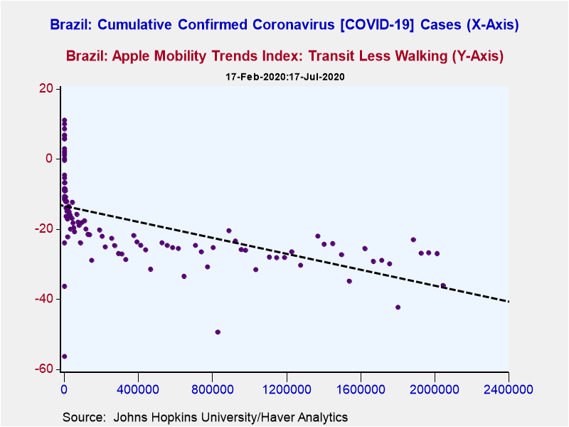
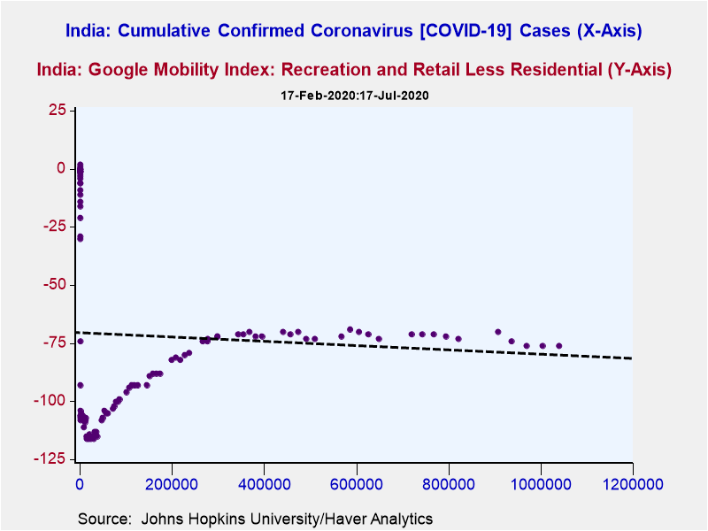
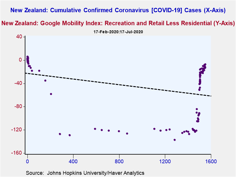
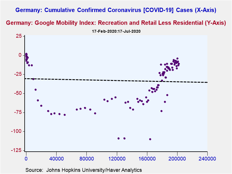
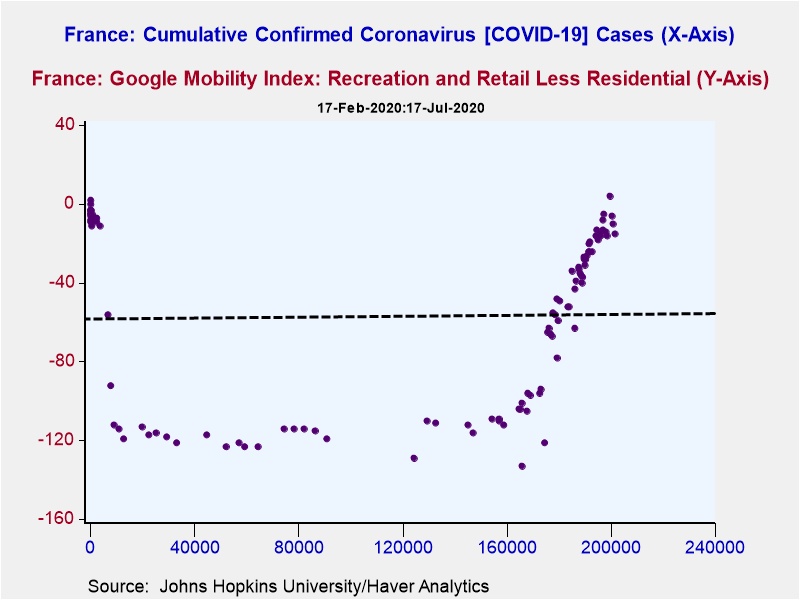
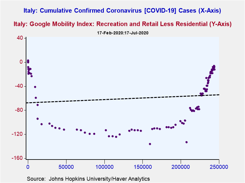
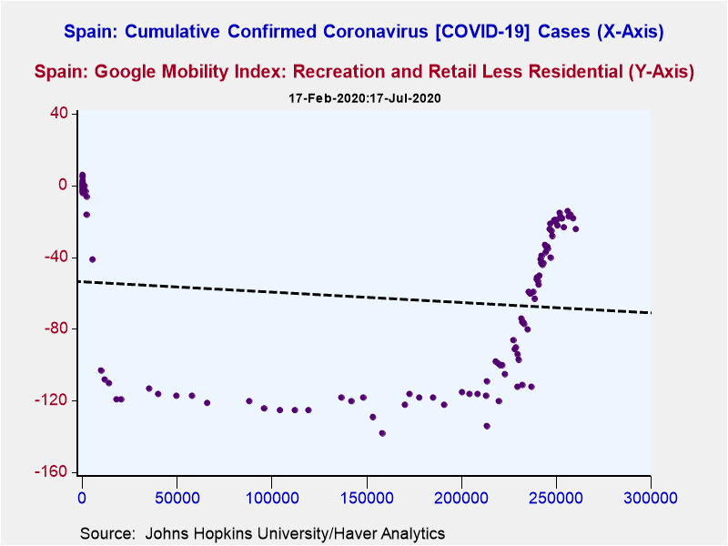
In the charts that follow we show some of this data in cross plots against cumulative numbers of Coronavirus cases. Those countries that are best-placed to embark on a V-shaped recovery will be those where the aforementioned data for mobility or dining is recovering sharply on the vertical axis but not – at the same time as this – triggering higher number of Coronavirus cases on the horizontal axis. Sharp northerly movements toward the end of the sample period would be consistent with this. Of those countries that we have chosen to illustrate this data for, New Zealand, France, Italy and until recently Spain presently appear to be in that V-shaped camp.
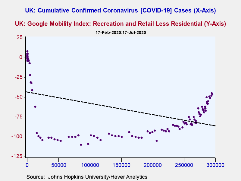
Countries on the other hand that are destined to see a slower U-shaped recovery or a recovery that's snuffed out entirely to form an L will instead see flat lining toward the east or a downshift toward the south east as ebbing mobility trends or fading numbers of restaurant diners combine with much higher numbers of Coronavirus cases. Brazil, India and to a lesser extent the US presently fall into the L-shaped camp while the UK is half way between the V and the L and is thus looking more U-shaped.
Viewpoint commentaries are the opinions of the author and do not reflect the views of Haver Analytics.Andrew Cates
AuthorMore in Author Profile »Andy Cates joined Haver Analytics as a Senior Economist in 2020. Andy has more than 25 years of experience forecasting the global economic outlook and in assessing the implications for policy settings and financial markets. He has held various senior positions in London in a number of Investment Banks including as Head of Developed Markets Economics at Nomura and as Chief Eurozone Economist at RBS. These followed a spell of 21 years as Senior International Economist at UBS, 5 of which were spent in Singapore. Prior to his time in financial services Andy was a UK economist at HM Treasury in London holding positions in the domestic forecasting and macroeconomic modelling units. He has a BA in Economics from the University of York and an MSc in Economics and Econometrics from the University of Southampton.


