Global| Oct 06 2008
U.S. Misery Index Highest Since 1991
by:Tom Moeller
|in:Economy in Brief
Summary
The so-called misery index is a constructed U.S. business cycle indicator. It adds the year-to-year change in the CPI to the unemployment rate. Thus, for those who are employed it measures the degree to which their incomes are being [...]
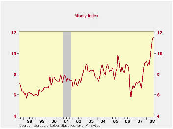
The so-called misery index is a constructed U.S. business cycle indicator. It adds the year-to-year change in the CPI to the unemployment rate. Thus, for those who are employed it measures the degree to which their incomes are being eroded by higher prices. For those who are unemployed that erosion hits the diminished level of dollars from an unemployment benefit.
During the past year, the misery index has climbed to 11.5 which was its highest level since early 1991.
The increase during the past year from 6.7 is due to gains in
both of the two components of the index, but the 4.8 point jump since
August of last year has been more driven by the rise in energy prices.
Higher gasoline prices drove the change in the CPI up 3.5 points to
5.4%. Higher unemployment caused the unemployment rate to rise a lesser
1.4 points.
Over the very short term the recent decline in gasoline prices likely will cause the misery index to level out. The CPI's increase should drop to roughly 4.0%. However, a continued increase in the unemployment rate will offset at least some of that decline. The combination would leave the index still above last year's average and on a monthly basis near the highest level since 2005.
The misery index can be found in Haver's USECON database under Business Cycle Indicators.
Oil Prices and Inflation from the Federal Reserve Bank of San Francisco can be found here.
Back to the Future with Keynes from the Federal Reserve Bank of Minneapolis is available here.
| U.S. Misery Index | August | July | Y/Y | 2007 | 2006 | 2005 |
|---|---|---|---|---|---|---|
| Misery Index | 11.5 | 11.3 | 6.7 | 2.9 | 3.2 | 3.4 |
| CPI | 5.4 | 5.5 | 1.9 | 2.9 | 3.2 | 3.5 |
| Unemployment Rate | 6.1 | 5.7 | 4.7 | 4.6 | 4.6 | 5.1 |
by Robert Brusca October 6, 2008
As we sit in the middle of a growing financial crisis exchange rates position countries in specific competitiveness cohorts. Much of what has transpired in the past few years has been framed importantly by those exchange rate movements. This is so true that it would be hard to go back and to decide which caused which to happen: Did high oil hurt the dollar or did a weak dollar push up oil?
The real broad effective dollar index is down by 13.3% over 36 months. That term means that the index is the dollar’s value adjusted for inflation effects against a wide group of currencies in which weights are applied to reflect the importance of these countries in trade. The euro is up by 11% on a similar measure and yen is down by 13% over that same period. Currencies are not a zero sum game unless you include all the world’s currencies in the framework. The dollar can move differently Vs different currencies so it could theoretically fall Vs the euro but rise enough Vs the Canadian dollar (which is more important in terms of the size of bilateral direct trade flows) to push the broad US exchange rate index up.
Right now the world crises catches the dollar in the bottom 1% of its queue of (real) values since 1973. The yen is also low in its range, in the 2.8 percentile. The euro is strong in the top 98 percentile of its range. And… what got currencies into these positions is also partly what got us in trouble.
The EURO shot up and with the ECB focus on its ONE mandate as it cheered too much for that inflation fighting rise in the exchange rate as oil prices spurted. Yet it was the euro’s rise that helped the dollar to fall and with the world’s commodity prices denominated in dollars that helped to stoke up dollar commodity prices. This dynamic continued to help to push commodity prices as a spiral developed that included oil- especially oil!
As a result of such polices and currency shifts we find Europe currently undermined by foreign exchange strength whose lagged effects are finally taking a toll on EMU members. In the US a weakening US economy has seen its drop in domestic activity softened by strong US exports (and weaker imports) due importantly to a weakening and highly competitive dollar.
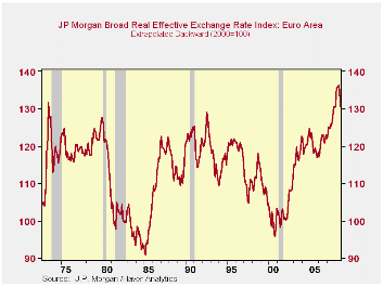
In the top chart we plot the broad real effective EMU exchange rate. Using EMU weights it has been projected backward to before the time that the EMU existed to show just how strong the euro has become. When the individual currencies of EMU member countries existed there was not a time when they collectively were as strong as they got to be in this cycle. This is why I have been warning for so long that Europe was going to slow down. Europe is a trading place. And while much of its trade is intra-Europe that is still not the same as intra-state shipments within the US. Intra EMU trading does eliminate the need for foreign exchange and there is a good deal of product homogenization in Europe but you still are dealing with a foreigner when you ship goods across national lines within EMU. For that reason a strong external exchange rate can undermine intra-EMU regional trade more easily than intra-state trade in the US.
On balance the strong euro is now an added burden for Europe where fiscal policy is off the table due to its Maastricht budget constraints. Coordinated programs for troubled banks are harder to get because of their members’ still-separate fiscal situations. The much vaunted EMU and EU customs trade union and monetary union are showing their Achilles Heels. Europe is not one country. It is no united states of Europe and this fact is one of the main things that has held it back and that continues to impede its operation in this crisis.
| Trade weighted FX Broad Real Range and Movements | ||||
|---|---|---|---|---|
| Aug-08 | US | EMU | Japan | UK |
| Current Index | 77.6 | 132.6 | 68.4 | 87.8 |
| Rank percentile | 1.2% | 98.6% | 2.8% | 30.6% |
| 12-Mo % | -6.3% | 5.7% | 0.4% | -11.8% |
| 24-Mo % | -9.5% | 7.8% | -4.6% | -10.4% |
| 36-Mo% | -13.3% | 11.0% | -13.1% | -9.0% |
by Louise Curley October 6, 2008
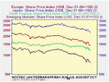 Stock prices in Europe, Japan and the emerging markets
appear to have moved in lock step with those in North America over the
past year as shown in the first chart that plots Morgan Stanley Capital
International (MSCI) daily stock prices. This is in contrast
to earlier periods when it was possible to reduce risk by geographic
diversification, particularly into the emerging
markets.
Stock prices in Europe, Japan and the emerging markets
appear to have moved in lock step with those in North America over the
past year as shown in the first chart that plots Morgan Stanley Capital
International (MSCI) daily stock prices. This is in contrast
to earlier periods when it was possible to reduce risk by geographic
diversification, particularly into the emerging
markets.
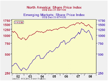
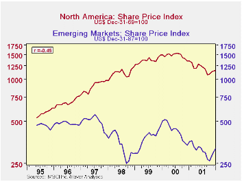
When emerging markets began to be a significant factor in the universe of world's stock markets, their stock prices tended to move independently of those in the developed markets. From May 1995 to December, 2001, the correlation between the stock prices of the emerging markets and those of North America, for example, was .46 as shown in the second chart. The R2 = .21, means that only 21% of the change in one market affected the other market. Since then the prices of the two stock markets have tended to move together. The third chart shows that the correlation between the two series from January 2002 to the present has risen to .96, with an R2 = .92, indicating that 92% of the change in one markets affected the other market. These charts are based on the monthly MSCI data. (Charts showing the prices of emerging markets with other developed markets, such as Japan and Europe show similar differences in the two periods.)
| MSCI
STOCK PRICE INDEXES ( Month to Month % Change) |
Sep 08 | Aug 08 | Jul 08 | Jun 08 | May 08 |
|---|---|---|---|---|---|
| Emerging Markets | -13.3 | -5.7 | -8.9 | -6.2 | 3.8 |
| United States | -5.1 | 1.0 | -6.4 | -3.7 | 2.9 |
| Europe | -8.4 | -3.2 | -6.6 | -6.2 | 1.3 |
| Japan | -4.4 | -5.5 | -6.8 | -2.0 | 4.3 |

Tom Moeller
AuthorMore in Author Profile »Prior to joining Haver Analytics in 2000, Mr. Moeller worked as the Economist at Chancellor Capital Management from 1985 to 1999. There, he developed comprehensive economic forecasts and interpreted economic data for equity and fixed income portfolio managers. Also at Chancellor, Mr. Moeller worked as an equity analyst and was responsible for researching and rating companies in the economically sensitive automobile and housing industries for investment in Chancellor’s equity portfolio. Prior to joining Chancellor, Mr. Moeller was an Economist at Citibank from 1979 to 1984. He also analyzed pricing behavior in the metals industry for the Council on Wage and Price Stability in Washington, D.C. In 1999, Mr. Moeller received the award for most accurate forecast from the Forecasters' Club of New York. From 1990 to 1992 he was President of the New York Association for Business Economists. Mr. Moeller earned an M.B.A. in Finance from Fordham University, where he graduated in 1987. He holds a Bachelor of Arts in Economics from George Washington University.
More Economy in Brief
 Global| Feb 05 2026
Charts of the Week: Balanced Policy, Resilient Data and AI Narratives
by:Andrew Cates