Global| Mar 15 2007
U.S. PPI Surprise
Summary
Consumer prices in the Eurozone rose 1.8% in February from a year ago, the same as in January and 0.1% below December. In February 2006, the year-on-year change was 2.3%, boosted by strong energy gains. In the most recent months, [...]
| The PPI surprised us with an unexpectedly strong headline jump of 1.3% and an accompanying core rate that rose by 0.4%. Neither was as expected, nor welcome. I consider myself an inflation agnostic but I have run into quite a number of disinflation believers recently and not many inflation-fearers. So being an inflation agnostic is being at one end of the spectrum these days. Increasingly I have heard people wonder when the Fed will dismantle its bias and further ask when the Fed is going to start cutting interest rates…not ‘if’, but ‘when’. And may be that will prove to be the correct tact for policy. But for now the question seems to be much more up in the air. For now- at least until we see the Friday CPI- the question has become a live one. Let’s begin to look at PPI inflation through the lens of a proprietary calculation I make using Haver data. I transform it as follows to form a measure of inflation diffusion: This calculation checks though all the PPI components assessing if inflation rose or fell in the recent Yr/Yr period compared to the Yr/Yr change of one year ago. From these comparisons we use logical operators to count the percentage of PPI components where inflation has accelerated, decelerated or remained the same. We group them and from these sums we construct ISM-like diffusion indexes. In that framework a value of 50 is neutral. Any value above 50 shows more underlying components are afflicted by inflation rising; below a value of 50 relatively more components are seeing inflation fall. The results for February 2007 are in the table below:
The diffusion approach I use does not weight components. The idea is that if we have inflation, it is by definition broad-based and should show up across components. If the monthly headline or core inflation spikes but diffusion remains below 50 we discern that one or ‘several’ components with relatively large weights saw prices rise, but that the rise was not widespread. In that case the impact on the price level probably reflected more an initial shift in relative prices than in inflation. This approach has the advantage of being objective each month and does require subtracting the biggest price surge or the largest drop to get a better gauge of what is going on with inflation. Diffusion is the gauge of what is going on. See chart below: |
Summary of PPI and Diffusion
Inflation Diffusion | Year/Year From Yr Ago | Feb-07 | Feb-06 | Feb-07 | Feb-06 | PPI Total | 2.5% | 3.9% | 51.9 | 39.0 | PPI Core | 1.8% | 1.7% | 54.1 | 42.9 | Consumer Goods | Consumer Foods | 6.8% | -1.0% | 83.3 | 44.4 | Core Consumer | 1.8% | 1.7% | 56.3 | 45.8 | Capital Goods | 2.2% | 1.6% | 52.0 | 44.0 | |||||||||||||||||||||||||||||||||||||||||||||||||||||||||||||||
|---|---|---|---|---|---|---|---|---|---|---|---|---|---|---|---|---|---|---|---|---|---|---|---|---|---|---|---|---|---|---|---|---|---|---|---|---|---|---|---|---|---|---|---|---|---|---|---|---|---|---|---|---|---|---|---|---|---|---|---|---|---|---|---|---|---|---|---|---|---|---|---|---|---|---|---|---|---|---|---|---|---|---|---|---|---|---|---|---|---|---|---|---|---|---|---|
| Summary of PPI and Diffusion | |||||||||||||||||||||||||||||||||||||||||||||||||||||||||||||||||||||||||||||||||||||||||||||||
| Inflation | Diffusion | ||||||||||||||||||||||||||||||||||||||||||||||||||||||||||||||||||||||||||||||||||||||||||||||
| Year/Year | From Yr Ago | ||||||||||||||||||||||||||||||||||||||||||||||||||||||||||||||||||||||||||||||||||||||||||||||
| Feb-07 | Feb-06 | Feb-07 | Feb-06 | ||||||||||||||||||||||||||||||||||||||||||||||||||||||||||||||||||||||||||||||||||||||||||||
| PPI Total | 2.5% | 3.9% | 51.9 | 39.0 | |||||||||||||||||||||||||||||||||||||||||||||||||||||||||||||||||||||||||||||||||||||||||||
| PPI Core | 1.8% | 1.7% | 54.1 | 42.9 | |||||||||||||||||||||||||||||||||||||||||||||||||||||||||||||||||||||||||||||||||||||||||||
| Consumer Goods | |||||||||||||||||||||||||||||||||||||||||||||||||||||||||||||||||||||||||||||||||||||||||||||||
| Consumer Foods | 6.8% | -1.0% | 83.3 | 44.4 | |||||||||||||||||||||||||||||||||||||||||||||||||||||||||||||||||||||||||||||||||||||||||||
| Core Consumer | 1.8% | 1.7% | 56.3 | 45.8 | |||||||||||||||||||||||||||||||||||||||||||||||||||||||||||||||||||||||||||||||||||||||||||
| Capital Goods | 2.2% | 1.6% | 52.0 | 44.0 | |||||||||||||||||||||||||||||||||||||||||||||||||||||||||||||||||||||||||||||||||||||||||||
| Inflation | Diffusion | ||||
| Year/Year | From Yr Ago | ||||
| Feb-07 | Feb-06 | Feb-07 | Feb-06 | ||
| PPI Total | 2.5% | 3.9% | 51.9 | 39.0 | |
| PPI Core | 1.8% | 1.7% | 54.1 | 42.9 | |
| Consumer Goods | |||||
| Consumer Foods | 6.8% | -1.0% | 83.3 | 44.4 | |
| Core Consumer | 1.8% | 1.7% | 56.3 | 45.8 | |
| Capital Goods | 2.2% | 1.6% | 52.0 | 44.0 | |
The chart above shows you how diffusion tracks changes in core inflation. Note that the diffusion index generally changes a little before actual inflation trends do. Diffusion below 50 usually points to a falling inflation rate and above 50 the rate of inflation is usually rising. Current diffusion for core consumer goods at the PPI level shows inflation pressures are RISING. The period of downward pressure on inflation is over- at least for now. 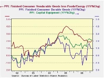 A conventional time series plot of the core components of the PPI shows elevation in inflation spreads across most main PPI categories core consumer nondurables, core consumer durables and capital goods. Consumer durables prices let off a bit of steam this month but the pace of inflation they carry is still high by recent standards. A conventional time series plot of the core components of the PPI shows elevation in inflation spreads across most main PPI categories core consumer nondurables, core consumer durables and capital goods. Consumer durables prices let off a bit of steam this month but the pace of inflation they carry is still high by recent standards. As we look ahead to the CPI we can look to the trends for consumer prices embedded in the PPI to see if CPI goods prices have inflation pressures. Core nondurable goods prices have growing pressures. Durable goods prices had growing pressures but those have subsided in the most recent three months. Remember that to these trends we add imports of consumer goods and all consumer services. The producer prices contribution to the core CPI is only about 30%. And as we consider adding import prices we saw in the import prices report that those pressures were not strong in February. For services we have little to go on. Price diffusion did ease off in the non-mfg ISM in February but it was still over 53 in value. Plus labor costs seem to be showing pressure while productivity is lagging. The inflation risks still seem to be on the upside to me, at least for now. At least I don’t think it’s a good time to assume that inflation is not a problem. |
| Feb-07 | Jan-07 | Dec-06 | 3-mo | 6-mo | 12-mo | |
| Residential Electric Power | 1.1% | 1.1% | 0.3% | 10.7% | -7.6% | 5.8% |
| Residential gas | 1.7% | -1.4% | 0.9% | 4.9% | 12.8% | -29.4% |
| Gasoline | 5.1% | -6.3% | 1.4% | -0.7% | -69.2% | 21.2% |
| Fuel Oil | 4.9% | -9.4% | -1.0% | -21.6% | -53.6% | 18.1% |
| I had some high hopes for the Philly and NY regions that give us our first readings for March. Instead it is some bitter disappointment. Maybe the reports do reflect deteriorated fundamentals. Maybe it is the unseasonable cold weather in the Northeast. Maybe these regions are just not good proxies for the national ISM as they have been failing in that role for several months. Hope springs eternal, but these days so does disappointment. The chart below plots two lines for the Empire State index. One series is its headline barometer that is a directly surveyed response. The other is weighting of the responses to create a headline comparable to that of the ISM. The Empire State report does not issue such a weighted index. I construct it using ISM like weights. That construction is useful. In this case you can see that Empire State managers are usually more upbeat than their own weighted responses in the survey. In the past when they have not been, the result has been for the survey to pop back strongly the next months. Managers exhibited ‘unrequited pessimism’ last in April 2003 and in May of 2005 – just as they have this month. Each time the drop in the mangers’ response was a false alarm. Is it again? |
|---|
| The Empire State survey also has an outlook index. While the managers have been cutting their outlook it is also true that the ongoing reduction in that outlook has steadied in recent months. Both the weighted index for the outlook (constructed just as the one for current activity) and the current index show the same sort of flattening. For other regions that have an outlook survey and a longer series of available data we find that a reduction in the outlook index is a normal aspect of a maturing economic recovery. |
|---|
| For another sort of assessment we offer the Empire State data placed in a range according to actual variability of the respective components or simply by ranking and constructing a percentile. We calculate percentile near the bottom of the table to position each component in its range of values or rankings. We find that the weighted index shows a higher reading generally than does the raw monthly barometer. We also find that only three Empire State components are below the 45th percentile of their range- and that is not very weak. Unfortunately those three weak components are: orders, unfilled orders and delivery speeds. Job readings (typically lagging components) are in the top third of their range and hours-worked are in the top 40th percentile of their range. However if we look at the percentile data constructed from rankings, the current observations do look weaker. |
|---|
| General | New | Shipm. | Unfilled | Delivery | Inventory | Prices | Prices | Employ | Avg | WGHT | Outlook | |
| Business | Orders | Orders | Time | Paid | Received | Hrs | Index | Index | ||||
| Mar-07 | 1.85 | 3.14 | 18.54 | -8.14 | -4.65 | -4.65 | 30.23 | 10.47 | 11.37 | 12.79 | 5.54 | 35.17 |
| Feb-07 | 24.35 | 18.93 | 27.07 | 0.00 | -3.23 | -7.53 | 26.88 | 12.90 | 12.70 | 5.38 | 13.28 | 38.49 |
| Jan-07 | 9.13 | 10.26 | 16.11 | -8.51 | -5.32 | -19.15 | 35.11 | 19.15 | 6.91 | -1.06 | 4.84 | 32.54 |
| Dec-06 | 22.19 | 22.52 | 27.60 | -14.61 | 1.12 | -7.87 | 28.09 | 13.48 | 18.60 | 7.87 | 14.31 | 41.85 |
| Nov-06 | 25.00 | 21.10 | 26.96 | 0.00 | 4.72 | 3.77 | 34.90 | 16.98 | 23.85 | 10.38 | 17.50 | 36.75 |
| Oct-06 | 21.19 | 12.94 | 22.91 | -3.33 | -5.00 | 2.50 | 30.83 | 17.50 | 20.06 | 14.17 | 12.04 | 32.20 |
| Sep-06 | 15.40 | 15.37 | 21.05 | -3.00 | 0.00 | -4.00 | 41.00 | 16.00 | 13.28 | 23.00 | 11.17 | 35.89 |
| Averages | ||||||||||||
| 3mo | 11.78 | 10.78 | 20.57 | -5.55 | -4.40 | -10.44 | 30.74 | 14.17 | 10.33 | 5.70 | 7.89 | 51.20 |
| 6-mo | 17.29 | 14.82 | 23.20 | -5.77 | -2.06 | -5.49 | 31.01 | 15.08 | 15.58 | 8.26 | 11.25 | 50.83 |
| 12-mo | 17.63 | 16.30 | 21.25 | -1.69 | 0.72 | -5.52 | 37.97 | 15.49 | 12.50 | 10.52 | 12.13 | 49.65 |
| Since Jan-02 | ||||||||||||
| Max | 38.9 | 38.01 | 44.33 | 20.83 | 12.5 | 8.62 | 60.58 | 27.73 | 23.98 | 29.17 | 29.6655 | 68 |
| Min | -17.08 | -9.04 | -2.59 | -19.57 | -15.46 | -20.62 | -5.15 | -18.89 | -23.15 | -11.96 | -9.343 | 31.37 |
| Avg | 17.26 | 17.50 | 20.34 | -1.76 | -1.72 | -4.11 | 31.22 | 4.61 | 7.01 | 6.98 | 10.63 | 43.02 |
| % of: | ||||||||||||
| Range | 33.8% | 25.9% | 45.0% | 28.3% | 38.7% | 54.6% | 53.8% | 63.0% | 73.2% | 60.2% | 38.1% | 10.4% |
| Ranking | 9.5% | 7.9% | 41.3% | 25.4% | 39.7% | 39.7% | 46.0% | 49.2% | 61.9% | 76.2% | 28.6% | 6.3% |
| raw rank | 57 | 58 | 37 | 47 | 38 | 38 | 34 | 32 | 24 | 15 | 45 | 59 |
| out of: | 63 | 63 | 63 | 63 | 63 | 63 | 63 | 63 | 63 | 63 | 63 | 63 |
| (NOTE: The difference is that the rankings show position that is purely ordinal. The difference between being 63rd and 62nd is one rank, the same as the difference between being 9th and 10th. However, since there are only 63 ranks when we look at the percentiles of the range that weakest entry might represent a sharp drop and larger distance from number 62 than is observation 9 from 10. In this way the percent of range data may make current readings look too strong, that is true if the weakest reading for a series is particularly weak and possibly an outlier. In that case the weak outlier will stretch the range and few observations will seem to be as weak as the weakest. So in using these rankings, take your pick. For our ranking and range assessment purposes, we use data from January 2002 forward since the early Empire State readings seem to have had some flaky responses). Summing up On balance the Empire State report is a weak report, but it may not be as weak as its headline suggests. Its own outlook index shows much less spikiness and only a moderate settling in the outlook profile. And remember that this indicator has a relatively short history going back only to mid-2001. We do not have any observations in it that draw from a period of real weak economic activity. |
|---|
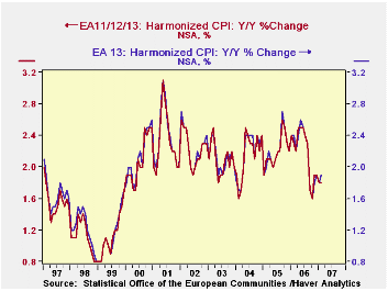
Consumer prices in the Eurozone rose 1.8% in February from a year ago, the same as in January and 0.1% below December. In February 2006, the year-on-year change was 2.3%, boosted by strong energy gains.
In the most recent months, energy prices have slowed, as is well known. But a version of a "core" HICP has picked up. A year ago, when energy was running rampant, the index less energy and food/alcohol/tobacco was very slow at 1.2% year-on-year. Now, this core rate has picked up to 1.7% in January and 1.9% in February. Several sectors are participating: clothing prices in particular have stopped falling. While rising only about 1%, they have turned around from earlier outright declines. Household maintenance and repairs have gained, as well as home furnishings and housekeeping products. Health care costs are rising this year. There have been modest accelerations of education costs, hotels and restaurants and "other". Communications prices are still falling, but much less than they had been.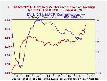
So while both the total HICP and this core measure are hovering below the ECB's comfort rate of 2%, the breadth of the price increases is opening up concern over inflation. Over the last 15 months, the ECB has raised its target rate seven times, most recently on March 8 to 3.75%. [This is the minimum bid rate for conducting refinancing operations at the Bank.]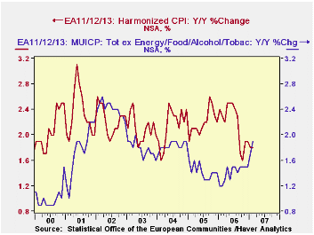
Note that these price data cover series denoted in Haver's databases as "EA11/12/13". This grouping includes the new members of the Monetary Union only as they join, not earlier. Prior to 2001, there were 11 members; Greece was added then and finally Slovenia just this year. The data are not "break adjusted", as is an alternative series, which we call EA13 and which includes Greece and Slovenia since the beginning of these data in 1996. As seen in the accompanying graph, there is hardly any visible difference in the groupings. But there are small differences in individual periods: for instance, the "headline rate" for EA11/12/13 this month is 1.8%, but the comparable EA 13 figure is 1.9%.
| EA11/12/13 Yr/Yr % Changes | Feb 2007 | Jan 2007 | Dec 2006 | Year Ago | December/December|||
|---|---|---|---|---|---|---|---|
| 2006 | 2005 | 2004 | |||||
| HICP [MUICP] | 1.8 | 1.8 | 1.9 | 2.3 | 1.9 | 2.2 | 2.4 |
| Energy | 0.8 | 0.9 | 2.9 | 12.6 | 2.9 | 11.3 | 6.9 |
| Ex Energy, Food/- Alcohol/Tobacco | 1.9 | 1.7 | 1.5 | 1.2 | 1.5 | 1.4 | 1.9 |
| Memo: EA 13 | 1.9 | 1.8 | 1.9 | 2.4 | 1.9 | 2.2 | 2.4 |

Robert Brusca
AuthorMore in Author Profile »Robert A. Brusca is Chief Economist of Fact and Opinion Economics, a consulting firm he founded in Manhattan. He has been an economist on Wall Street for over 25 years. He has visited central banking and large institutional clients in over 30 countries in his career as an economist. Mr. Brusca was a Divisional Research Chief at the Federal Reserve Bank of NY (Chief of the International Financial markets Division), a Fed Watcher at Irving Trust and Chief Economist at Nikko Securities International. He is widely quoted and appears in various media. Mr. Brusca holds an MA and Ph.D. in economics from Michigan State University and a BA in Economics from the University of Michigan. His research pursues his strong interests in non aligned policy economics as well as international economics. FAO Economics’ research targets investors to assist them in making better investment decisions in stocks, bonds and in a variety of international assets. The company does not manage money and has no conflicts in giving economic advice.
More Economy in Brief
 Global| Feb 05 2026
Charts of the Week: Balanced Policy, Resilient Data and AI Narratives
by:Andrew Cates