Global| May 19 2021
Car Registrations Soar in Terms of Year-on-Year Changes, But the Pace of Unit "Sales" Remains Underwhelming
Summary
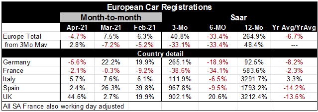
The chart above on auto registration really makes all the points you need on this month’s report. While we are schooled to look at percentage changes because they are fairer comparisons over time and free us of some the biases of [...]
 The chart above on auto registration really makes all the points you need on this month’s report. While we are schooled to look at percentage changes because they are fairer comparisons over time and free us of some the biases of looking at nominal data, the car registration data are real data if still crude since any vehicle sold and registered is treated the same - large or small. But it is a ‘real statistic, not one that is nominal. And the plot above that looks at registrations Vs retail sales volume shows that while retail sales volumes are climbing auto registrations are still in a limp for portion of their graph. Registrations are down this month (month-to-month) and the registration series is generally at a low point when compared to data back to 2010. Yet the percentage change loaded in the table shows 12-month percentage changes ranking in value from 92% to over 3000%! Even the briefest of looks at the graph make it clear that this percentage change is a result of the comparison to an extremely odd and weak base of registration volume from a year ago and not in the least because of any pickup in current data. There is no pick up in current registration data. This report, more than perhaps any other so far, should help to cement a view of why year-on-year data for a while are going to be unreliable guides to what is going on. Six month percent changes might be a good compromise to look at to check the status of current trends.
The small able to the left looks at data on two time spans and uses two different metrics to assay them. The top two panels of the chart use registrations pace data with the aggregated total Europe and smoothed total Europe in the small top panel. Country specific data are ranked in the second panel. There ae differences in the two time comparisons but those are not so meaningful this month. Looking at the rankings since 1995, we see total Europe registrations result evaluated in the lower 4.5 percentile historically – a reading that is extremely weak. Three-month smoothed data do not fare any better and actually are weaker.
The panel below that, in the middle, looks at country results, there the 1995 time line shows French registrations as the weakest at a 2.2 percentile standing and Spain at a 41.9 percentile standing as the relative strongest. All counties are below their respective median pace which occurs at a ranking of 50% (Spain does come close).
The bottom panel shows rankings based on the current year-on-year percentage changes and here all of a sudden all the weak and below median sales paces translate into top 1% results! The huge percentage gains year on year come from the comparison of this month’s anemic data with the year ago level when the bottom had dropped out of care sales and registrations. There is nothing in the current data that looks anything like the percentage changes that are reported out here and you certainly do not want to characterize this month report with a reference to percent changes and think that you have done anyone any favors by that analysis.
The bottom line for Europe is that the consumer is coming back. The retail volume index that the chart plots shows that there was an immediate surge in sales as Europe moved out of the stage one hit from the virus and then there was another, but much shallower decline. And now there is another rebound in progress of retail volumes from that secondary low. But car registrations have not joined in this second rebound. Registrations responded and rose sharply coming out of the first covid-19 hit compared to the dramatic lows of one year ago. However, registrations did not recoup any notion of their precovid-19 level. Instead, there was a brief recovery, registrations then began to erode then they dropped sharply again. They are just now starting to stabilize after that drop and they are stabilizing at a lower level. That is about all that they are doing. They are not in any sense rebounding.
Europe is in recovery mode but it is not like the American recovery. It is also still dealing with virus issues that make its recovery path more stepwise and less strong. This report is cautionary as was the report on GDP results by country. This is a time to be very careful about the economy data your present or that is represented to you. The usual ways of presenting data may not be the best ways to present things for even a few months more. We need to look at data in an open, broader, way and to try to react even less to the headlines of the reports we see especially if they look extreme.

Robert Brusca
AuthorMore in Author Profile »Robert A. Brusca is Chief Economist of Fact and Opinion Economics, a consulting firm he founded in Manhattan. He has been an economist on Wall Street for over 25 years. He has visited central banking and large institutional clients in over 30 countries in his career as an economist. Mr. Brusca was a Divisional Research Chief at the Federal Reserve Bank of NY (Chief of the International Financial markets Division), a Fed Watcher at Irving Trust and Chief Economist at Nikko Securities International. He is widely quoted and appears in various media. Mr. Brusca holds an MA and Ph.D. in economics from Michigan State University and a BA in Economics from the University of Michigan. His research pursues his strong interests in non aligned policy economics as well as international economics. FAO Economics’ research targets investors to assist them in making better investment decisions in stocks, bonds and in a variety of international assets. The company does not manage money and has no conflicts in giving economic advice.
More Economy in Brief
 Global| Feb 05 2026
Charts of the Week: Balanced Policy, Resilient Data and AI Narratives
by:Andrew Cates