 Global| Mar 24 2021
Consumer Price Inflation Is a Lagging Process with a Long Lag
Summary
The future course of consumer price inflation has been a hot topic of discussion in the financial media of late. On the one hand, there some analysts, myself included, who believe that higher inflation is on the way, and not just a [...]
The future course of consumer price inflation has been a hot topic of discussion in the financial media of late. On the one hand, there some analysts, myself included, who believe that higher inflation is on the way, and not just a one-time catch up event. If you asked the “inflation paranoids” why they thought higher inflation was in the cards, you probably would get a variety of different answers. Some might cite the surge in the federal budget deficit and/or federal expenditures as the inflation-generating factor. Others might cite demographics. I will argue that it is current and expected future Fed monetary policy that will generate higher future inflation. On the other hand, there are others who believe it is different this time with regard to inflation. High inflation was so Seventies. And with every monthly low inflation report, the “it's different this time” analysts feel more confident in their view.
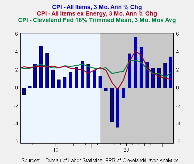
Before getting into my analysis, let's document that consumer price inflation currently is relatively low. Plotted in Chart 1 are the three-month annualized percent changes in the Consumer Price Index (CPI) for all items (the blue bars) and for all items except energy (the red line). In the three months ended February 2021, the CPI for all items increased at a rather brisk 3.47% annualized. Prior to the covid recession, you would have to go back to May 2019 for a three-month CPI inflation rate near this magnitude. Not that energy prices do not count in the inflation box score, but it does appear as though this recent uptick in consumer price inflation is primarily an energy story. This is demonstrated by the innocuous annualized change in the CPI of 0.96% in the three months ended February 2021 when energy prices are excluded.
Chart 1
The green line in Chart 1 represents the three-month average of the monthly annualized observations of the Cleveland Fed's 16% Trimmed Mean CPI. What the Cleveland Fed does is throw out the eight percent of the weighted components with the highest and lowest one-month price changes. The mean is calculated from the remaining components, making the 16% trimmed mean CPI much less volatile than either the CPI or the CPI excluding its food and energy components, the so-called “core” inflation CPI. It seems to me rather arbitrary to automatically exclude food and energy prices from the monthly CPI calculation. What if these price changes are neither large nor small, relatively? The Cleveland Fed Trimmed Mean resolves this arbitrariness by not excluding food, energy or any other price category from its CPI calculation unless the monthly change in a particular price is large or small compared to all prices. So, I believe that the Cleveland Trimmed Mean CPI is a better measure of the underlying rate of consumer price inflation than either the CPI-All Items or Core CPI. In the three months ended February 2021, the three-month average of the annualized change in the Cleveland Trimmed Mean CPI was a relatively low 1.72%, lower than it was prior to the covid recession.
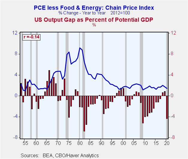
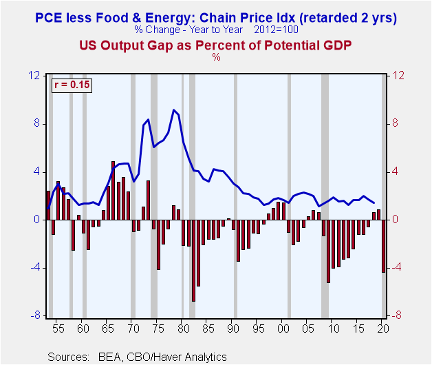
So, the current underlying rate of consumer price inflation appears to be relatively low. But what does that tell us about the future course of inflation? Zilch, because inflation is a lagging economic process. That is, inflation tends to rise after the pace of economic activity picks up and slow after the pace of economic activity slows. The Conference Board has known this for decades in as much as it categorizes the CPI inflation rate for services as a lagging economic indicator. In general, we would expect to see inflation rear its ugly head when real economic growth has been running above the economy's real potential growth rate. The Congressional Budget Office calculates a measure of potential real GDP by estimating the potential labor force, multifactor productivity and other secret seasonings. Then it calculates a percentage output gap, which is the difference between actual real GDP and potential real GDP divided by potential real GDP. When the output gap percentage is above zero, the economy is thought to be operating above its potential. When the percentage gap is below zero, the economy is thought to be operating below its potential. Plotted in Chart 2 are the annual data for the output gap percentage (the red bars) and the year-over-year percent changes in Personal Consumption Expenditure (PCE) chain price index excluding its food and energy price components (the blue line). Against my better judgment, I'm using the core PCE price index so that the direct effects of the energy/food negative supply shocks of the 1970s do not distort things. Theory tells us that there should be a positive correlation between these two series. For example, if the economy were operating above its potential, indicating excess aggregate demand, this should put upward pressure on consumer price inflation. But as you can see from the negative sign in front of the correlation coefficient in the upper left-hand corner of Chart 2, the two series are not positively related, but negatively related. That is, when the economy is running hot, inflation tends to be running cold. Is this yet another case of a beautiful theory destroyed by some ugly facts? Maybe not. For starters the absolute value of the correlation coefficient, 0.14, is low. But if we examine the lead-lag relationships between the consumer price inflation rate and the output gap percentage, we can come up with the “correct” sign, at least, albeit still with a relatively small absolute value of the correlation coefficient. This is shown in Chart 3. Same two series, but the core inflation rate is “retarded” by two years. So, the last data point for the core inflation rate (the blue line) is for 2020, but it is lined up with 2018. The output gap percentage for each year corresponds with the core consumer inflation rate two years in the future. When I test lead-lags, this was the highest I came up with. The largest impact of the output gap this year on inflation occurs two years later.
Chart 2 Chart 3
Not impressed? Neither am I. Something seems to be missing in explaining consumer inflation. Get your snifter of Lagavulin ready – thin-air credit! As I have described in previous commentaries, when the Fed creates currency and/or bank reserves, it figuratively creates these out of thin air. For example, when the Fed purchases a security from the public, say, a bond dealer, the dealer's account at its bank is credited by the amount of the securities sale and the bank's reserve account at the Fed is credited by the same amount. Where did these funds come from? Figuratively, from thin air. Let's say the bond dealer then purchases a newly-issued corporate or government bond. The issuer of the new bond then purchases something with the proceeds of the bond issuance. The bond issuer's spending increases. Does anyone else's spending have to decrease? No, because these funds were created figuratively out of thin air. When the banking system makes loans or purchases securities, the bank accounts of the borrowers are credited by the amount of the loan or the bank accounts of the sellers of securities are credited by the amount of the securities sale. Where did these funds come from? Figuratively, from thin air. Contrast this with the situation whereby I make a loan to you. Your bank account rises by the amount of the loan. Where do these funds come from? From my bank account, which I likely will replenish by reducing my current spending. You borrowed funds because you wanted to purchase something. So, your current spending rises while my current spending falls as I replenish my bank account after having depleted it with my loan to you. Net, net, there is no increase in aggregate spending. But if the banking system makes loans, which is credit created figuratively out of thin-air, then the borrowers' spending will increase without anyone else's spending decreasing. Net, net, when credit is created out of thin-air, there is an increase in aggregate spending. The faster credit created out of thin air grows, the faster is aggregate nominal spending likely to grow, which eventually results in higher inflation.
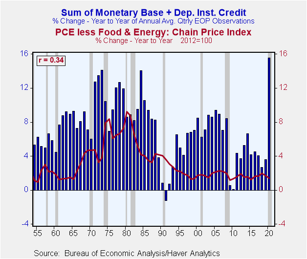
Let's look at some data. Plotted in Chart 4 the year-over-year percent changes in annual averages of thin-air credit (the blue mass) and the core PCE price index (the red line). Thin-air credit is the sum of the monetary base (currency plus depository institution reserves at the Fed) and loans and securities on the books of depository institutions. The correlation coefficient between the two has the “correct” sign, i.e., positive. When growth in thin-air credit is faster, core PCE price inflation is higher, and vice versa. But the absolute value of the correlation coefficient, 0.34, is nothing to write home about. Moreover, because the two series are plotted contemporaneously, causation is not apparent. Does thin-air credit growth cause inflation to rise or does higher inflation cause thin-air credit to grow faster?
Chart 4
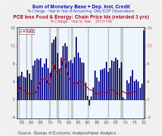
I examined different lead-lag relationships between the two series. I found that the highest absolute-value correlation coefficient (0.63) between the two occurred when percent changes in the core PCE price index were retarded three years relative to percent changes in thin-air credit and the sign for the correlation coefficient was positive. This is shown in Chart 5. So, again to explain what I mean by price inflation is “retarded” by three years, the last inflation data point shown in Chart 5 (the end of the red line) lines up with the year 2017 and growth in thin-air credit for 2017. But, because the inflation observations are “retarded” by three years, this last observation is the inflation rate for 2020, not 2017. So, in Chart 5, the percent change in thin-air credit for any given year is associated with the percent change in core inflation three years in the future. In sum, the highest correlation I found between these two series occurred when thin-air credit growth leads (causes?) inflation by three years. Again, consumer price inflation is a lagging economic process with a relatively long lag. How the Fed manages monetary policy today in terms of growth in thin-air credit is likely to have its largest impact on consumer price inflation three years from now.
Chart 5
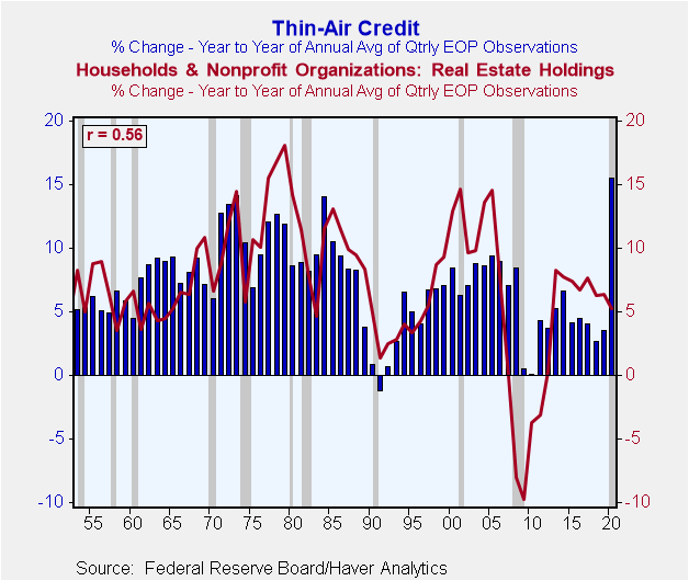
Still, something is missing. Current thin-air credit growth seems to do a good job of explaining future consumer price inflation from 1953 through the early 1980s, but not such a good job thereafter. Although thin-air credit growth from the 1990s has been low compared to that prior to the 1990s and consumer price inflation has been correspondingly low, too, inflation looks to be unusually low compared to thin-air credit growth. When thin-air credit increases, there is a presumption that “spending” will increase, too. Why borrow if you do not intend to purchase something. But that ‘something” might not be a currently-produced good or service. It might be an existing something, such as an existing house. If faster growth in thin-air credit growth is associated with increased demand for residential real estate and the supply of residential real estate is relatively static in the short run, then faster growth in thin-air credit might be associated with residential real estate inflation. And what do you know, the data in Chart 6 show that there is a relatively high positive correlation (0.56) contemporaneously between percentage changes in the nominal value of residential real estate and percentage changes in thin-air credit. But does thin-air credit growth cause growth in the value of residential real estate or vice versa? Because the value of the correlation coefficient falls off by less when thin-air credit growth leads versus when the value of real estate leads, we can tentatively say that the causality runs from thin-air credit growth to residential real estate value growth.
Chart 6
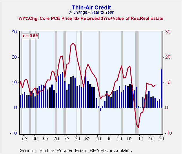
So, let's broaden our definition of inflation by combining residential real estate inflation to core consumer price inflation. Plotted in Chart 7 are the year-over year percent changes in the sum of the core PCE price index retarded three years plus the value of residential real estate (not retarded or advanced) and the year-over-year percent changes in thin-air credit. So, the last inflation data point plotted (the red line) represents the year-over-year percent change in the core PCE price index for the year 2020 plus the year-over-year percent change in the value of residential real estate for the year 2017. Clear as mud, right? The absolute value of the correlation coefficient improves to 0.69 when residential real estate inflation is added to retarded core PCE price inflation. Moreover, thin-air credit growth since the 1990s looks better related to this combined inflation measure. Now, if I only knew what determined the amount of newly-created thin-air credit that was used to purchase currently-produced goods and services and the amount spent on existing assets. I have a lot of thesis topics for budding economics Ph.D.s.
Chart 7
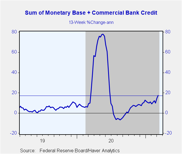
In 2020, average annual thin-air credit increased by a post-WWII record 15-1/2%. Some of this increase in thin-air credit was not spent on anything. For example, some of the recipients of the 2020 CARES Act “stimulus” checks simply kept them in an account at a depository institution. These banked-funds might be spent in 2021 as covid-related anxiety eases. Whatever the case, I do not expect 2021's growth in annual average thin-air growth to be as high as 2020's. However, Chart 8 shows that in the 13 weeks ended March 10, 2021, a somewhat narrower measure of thin-air credit continued to grow at a relatively high annualized rate of 17.3%. Most Fed officials have indicated that they are planning to be patient before removing monetary accommodation. The consensus of Federal Open Market Committee members is that the federal funds rate will not be lifted from its zero-to-0.25% range until 2024. Although I doubt the Fed will hold off until 2024 to raise the fed funds rate and slow monetary base growth, it is likely to maintain a very accommodative monetary policy in 2021 in the face of continued massive federal government credit demand and a pick up in private credit demand. This implies continued relatively high thin-air credit growth. Fed officials also have indicated they are willing to tolerate higher consumer price inflation in 2021 in the belief that it represents some kind of “catch up”. Moreover, the Fed is aiming to create a core consumer price inflation rate of 2% on average. Exactly over what period this average is to be measured has not been articulated. As I have demonstrated, the largest impact from current thin-air credit growth on consumer price inflation tends to occur three years later. So, inflation can remain subdued for a time after rapid thin-air credit growth only to suddenly flare up. Again, I expect the Fed to take actions well before 2024 that will result in slower growth in thin-air credit, but not before it sows the seeds of inflation higher than what has been experienced in recent decades.
Chart 8
Some analysts argue that large federal budget deficits and/or rapid growth in federal outlays in and of themselves produce higher inflation. I am not making that argument. High deficits, by definition, mean high government borrowing. If this borrowing is funded by thin-air credit and private sector credit demand is low, then thin-air credit growth need not be excessive. If this high government credit demand is funded by the nonbank public, then some private sector credit demand will not be funded as the structure of interest rates rise to ration the supply of credit. Again, no necessary pick up in consumer price inflation. However, persistent large government budget deficits, which will result in continued rapid growth in the stock of government debt can create political pressure on the Fed to create higher inflation in order to lessen the real costs of servicing the government debt. Is there a political willingness in the US to slow down the growth in federal spending? Entitlements for retirees? Defense, as we enter a new cold war with the People's Republic of China? Infrastructure? Is there a political willingness to raise taxes not only on the “rich”, but also on middle-income households? To me, that leaves the stealth tax of higher inflation to stabilize or bring down the ratio of federal debt to nominal private sector net worth.
Viewpoint commentaries are the opinions of the author and do not reflect the views of Haver Analytics.Paul L. Kasriel
AuthorMore in Author Profile »Mr. Kasriel is founder of Econtrarian, LLC, an economic-analysis consulting firm. Paul’s economic commentaries can be read on his blog, The Econtrarian. After 25 years of employment at The Northern Trust Company of Chicago, Paul retired from the chief economist position at the end of April 2012. Prior to joining The Northern Trust Company in August 1986, Paul was on the official staff of the Federal Reserve Bank of Chicago in the economic research department. Paul is a recipient of the annual Lawrence R. Klein award for the most accurate economic forecast over a four-year period among the approximately 50 participants in the Blue Chip Economic Indicators forecast survey. In January 2009, both The Wall Street Journal and Forbes cited Paul as one of the few economists who identified early on the formation of the housing bubble and the economic and financial market havoc that would ensue after the bubble inevitably burst. Under Paul’s leadership, The Northern Trust’s economic website was ranked in the top ten “most interesting” by The Wall Street Journal. Paul is the co-author of a book entitled Seven Indicators That Move Markets (McGraw-Hill, 2002). Paul resides on the beautiful peninsula of Door County, Wisconsin where he sails his salty 1967 Pearson Commander 26, sings in a community choir and struggles to learn how to play the bass guitar (actually the bass ukulele). Paul can be contacted by email at econtrarian@gmail.com or by telephone at 1-920-559-0375.


