 Global| Oct 25 2011
Measures of Income Distribution In Haver Databases
Summary
The distribution of income has become a hot political issue in the United States. Haver Analytics has a number of data bases that may be useful in discussing this issue. A classic measure of equality or inequality in the distribution [...]
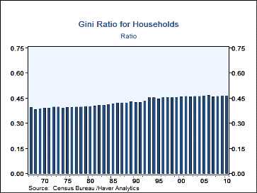
The distribution of income has become a hot political issue in the United States. Haver Analytics has a number of data bases that may be useful in discussing this issue. A classic measure of equality or inequality in the distribution of income is the Gini ratio which varies from 0 where income is perfectly divided among the population to 1 where one person holds all the income. Gini ratios for households in the United States from 1967 through 2010 are found in the database HGINI@USECON and shown in the first chart. The ratio rose from 0.386 in 1968 to 0.470 in 2006 and after a small drop rose to 0.469 in 2010. While the changes are small, they indicate a significant shift toward more inequality over the past 40 years or so.
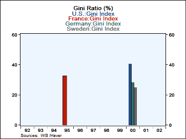
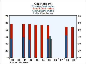
Gini Ratios are also available from time to time for a great many other countries at the World Bank database,GINI@WDI so that one can compare the distribution of income in the U. S. with that of other countries. Here the ratio is measured from 0 to 100. In the second chart we show Gini ratios for France, Germany, Sweden and the U. S. Sweden, as one might expect, had a relatively low ratio. In 2000, the Swedish Gini Ratio was 25 compared with 28.31 for Germany and 40.81 for the U. S. The most recent data for France's Gini ratio is 1995 when it was 32.74. Gini ratios for some of the emerging countries. Those for the BRIC countries are shown in the third chart. In 1995, when all four countries recorded Gini ratios, Brazil was the highest at 56.3, China was next at 43.53, then 37.51 for Russia and 36.8 for India. Later data show a slight decline in Brazil ratio and an increase in that of Russia.
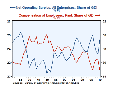
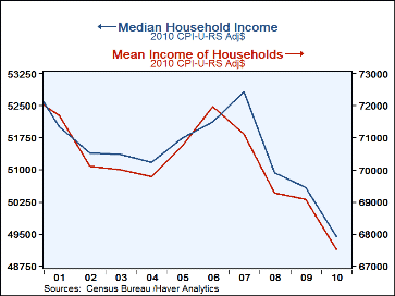
Among the other measures that are indicative changes in the income distribution are the shares of labor compensation and of the operating surplus in the national income. The fourth chart shows the decline in the share of compensation and the rise of the share of operating surplus. These data are from PAHYCOMD@USNA and PAHYSUR@USNA. The mean and the median household incomes adjusted for price changes have declined significantly since 2007 and 2008 as shown in the fifth chart. These data are found in RHI@USECON and RHNI@USECON.
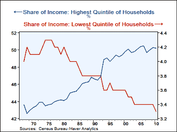
The sixth chart draws on some of the quintile data shown in the demographic section of USECON, specifically FIP1@USECON and FIP5@USECON. It shows the highest quintile tending to increase its share and the lowest quintile tending to decrease its share.


